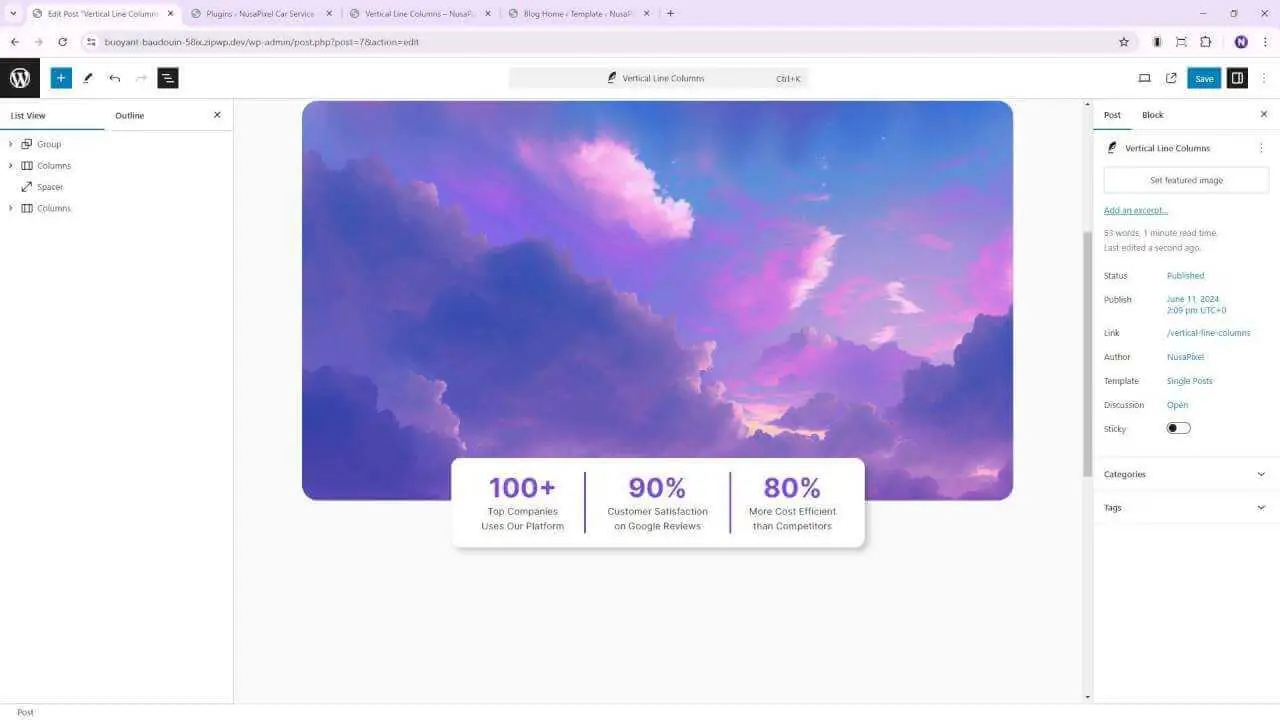
Adding a vertical line between columns in the Gutenberg editor can greatly enhance the visual appeal of your WordPress content. While there’s no built-in feature for this, there’s a simple workaround that doesn’t require any plugins or custom CSS. Let’s dive into how you can achieve this effect in just a few minutes.
The Basic Technique
The key to adding a vertical line between columns is to use the border feature of the column block. Here’s how:
- Create a columns block in your Gutenberg editor.
- Open the document overview and settings sidebar for easier navigation.
- Select the column where you want to add the line.
- Go to the Style menu in the sidebar.
- Click on the “Unlink sides” option for the border.
- Apply a border to just the right side of the column.
- Choose your desired color and adjust the border thickness (2 pixels works well).
That’s it! You’ve now added a vertical line between your columns.
Making It Mobile-Responsive
While this technique works great on desktop, it can look messy on mobile devices. Here are two approaches to handle this:
Option 1: Disable Column Stacking
- Select the entire columns block.
- Disable the “Stack on mobile” option.
This will maintain the column structure across all devices, keeping your vertical line intact.
Option 2: Use CSS for Mobile Responsiveness
If you prefer to keep the stacked layout on mobile but remove the vertical line, you can use some simple CSS:
- Add a CSS class to the column (e.g., “borderless-column”).
- Go to Appearance > Editor in your WordPress dashboard.
- Add the following CSS code:
@media (max-width: 600px) {
  .borderless-column {
    border: none !important;
  }
}
This code will remove the border when the screen size is less than 600 pixels.
Conclusion
Adding a vertical line between columns in Gutenberg is a simple yet effective way to improve your content’s visual structure. While it requires a bit of creativity to implement, the result can significantly enhance your page layout.
Remember, maintaining visual consistency across devices is crucial. Whether you choose to keep the columns side-by-side on mobile or opt for a stacked layout without the vertical line, ensure that your design looks great on all screen sizes.
By mastering these techniques, you’ll be able to create more visually appealing and professional-looking content in WordPress without relying on additional plugins or complex CSS code. Happy editing!


