- Bento grids offer a visually appealing way to organize content inspired by Japanese lunch boxes
- You can create bento grids in WordPress using only the built-in Gutenberg editor and core blocks
- The process involves strategically using columns, cover blocks, and customizing layouts for responsiveness
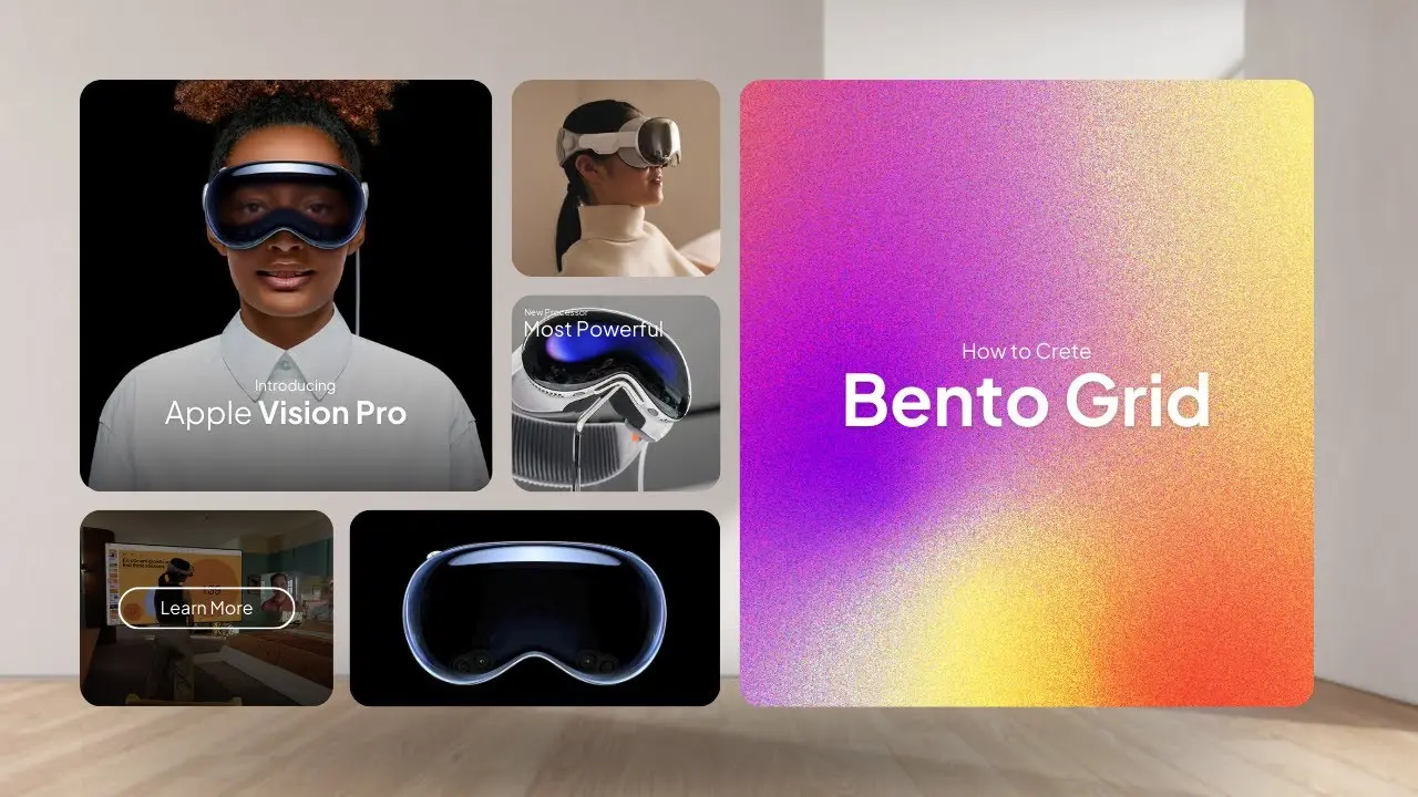
Have you ever looked at a website and marveled at its sleek, organized layout? Chances are, you might have encountered a bento grid design. As a web designer, I’ve been fascinated by this trend that’s been gaining traction lately. At first, I thought it was just another variation of the masonry grid, but boy, was I wrong! The bento grid design actually draws inspiration from Japanese bento boxes, where each compartment is carefully arranged to create a harmonious and compact presentation.
In this post, I’ll walk you through the process of creating a bento grid in WordPress without relying on any plugins. Trust me, it’s easier than you might think!
Let’s dive into the nitty-gritty of crafting a bento grid using nothing but the WordPress Gutenberg editor. I’ll guide you through each step, sharing some tips and tricks I’ve picked up along the way.
Getting Started with Columns
The foundation of our bento grid lies in the clever use of columns. Here’s how we begin:
- Open up your WordPress Gutenberg editor.
- Place your cursor where you want the grid and type “/columns” to add a column block.
- Choose a 66/33 split for your columns. This gives us a nice asymmetrical base to work with.
Now, we have our basic structure. But a bento grid is all about those distinct compartments, right? That’s where cover blocks come in handy.
Adding Cover Blocks
Cover blocks are the secret sauce of our bento grid. They allow us to create those eye-catching, image-based sections that make the design pop. Here’s how to set them up:
- Add a cover block to the left column.
- Choose an image for your cover. I picked a sleek image related to Vision Pro, but you can use whatever fits your content.
- Add some text to your cover. I went with “Vision Pro” to match the image.
- Adjust the text position. I moved mine to the top left corner for a modern look.
- Play with the opacity. I set mine to 30% to ensure the text remains readable.
- Add some border radius to soften the edges. This small detail can make a big difference in the overall feel of your grid.
Duplicating and Customizing
Here’s a time-saving tip: once you’ve got one cover block set up just right, you can easily duplicate it. This ensures consistency across your grid while allowing for quick customization. Here’s how:
- Copy your first cover block.
- Paste it into the next row.
- Adjust the size to fit your design.
- Change the text and image to suit your needs.
I created a smaller cover block with the text “Apps” and a different image. Then, I duplicated this process again for a third cover block. Before I knew it, I had the beginnings of a classic bento grid layout.
Making It Mobile-Friendly
In today’s mobile-first world, we can’t forget about responsiveness. To ensure your bento grid looks great on all devices:
- Go to the document overview.
- Select the entire column.
- Remove any features that might disrupt the mobile layout.
This step helps maintain the structure of your bento grid across devices. However, if you prefer a stacked layout on mobile, that’s perfectly fine too. It’s all about what works best for your content and audience.
Adding More Rows
To expand your bento grid, you don’t need to start from scratch. Simply:
- Duplicate your existing column.
- Adjust the column sizes for variety. I changed mine to a 40/60 split.
- Customize the content in each new cover block.
Spicing It Up with Video
Want to add some movement to your grid? Try incorporating a video cover block:
- Replace an image cover with a video cover.
- Ensure autoplay is enabled for a seamless experience.
- Check your text color – you might need to adjust it to ensure visibility against the video background.
And there you have it! A fully functional, visually appealing bento grid created entirely within WordPress, no plugins required. The beauty of this method is its flexibility. You can easily adjust sizes, swap out images or videos, and tweak text to create a unique design that perfectly fits your content.
Taking It Further
If you’re looking to add even more visual interest to your bento grid, consider implementing a parallax effect. This can add depth and dynamism to your design, making it truly stand out. How to create scroll to top in Gutenberg without plugin is a great resource to learn more about adding interactive elements to your WordPress site without relying on plugins.
Remember, the key to a successful bento grid is balance. Just like arranging a bento box, you want each section to complement the others while maintaining a cohesive overall look. Don’t be afraid to experiment with different layouts, color schemes, and content types to find what works best for your site.
As you become more comfortable with creating bento grids, you might want to explore other ways to enhance your WordPress site. For instance, learning how to insert Gutenberg blocks in WordPress can open up a world of possibilities for customizing your site’s layout and functionality.
In conclusion, bento grids offer a fresh, organized approach to web design that can significantly improve your site’s visual appeal and user experience. By mastering this technique using nothing but WordPress’s built-in tools, you’re adding a valuable skill to your web design toolkit. So go ahead, give it a try, and watch as your website transforms into a beautifully arranged digital bento box!