- Learn to build an eye-catching pros and cons table using WordPress Gutenberg editor
- Discover how to customize colors, borders, and layout for a professional look
- Understand the process of making your table responsive for different screen sizes
Creating a visually appealing and responsive pros and cons table for your WordPress site doesn’t have to be complicated or require any plugins. In this tutorial, I’ll walk you through the process of building a sleek, customizable table using just the WordPress Gutenberg editor. This method is perfect for bloggers, reviewers, or anyone looking to present information in a clear, organized manner.
Let’s dive into the step-by-step process of creating this table. I’ll share some tips and tricks along the way to help you make the most of this powerful built-in WordPress feature.
Getting Started with the Gutenberg Editor
The first step in our journey is to open up the Gutenberg editor. If you’re not familiar with it, don’t worry – it’s quite intuitive once you get the hang of it. I always start by opening the document overview. This might seem like a small step, but trust me, it’s a game-changer when it comes to organizing multiple blocks later on.
Now, let’s add our first block – the Group block. To do this, simply type “/Group” and select it from the options that appear. Choose a layout that suits your needs. This Group block will serve as the container for our entire pros and cons table.
Creating the Table Structure
Next, we’re going to add a Columns block inside our Group block. This will give us two columns – one for the pros and one for the cons. It’s a simple yet effective way to visually separate our content.
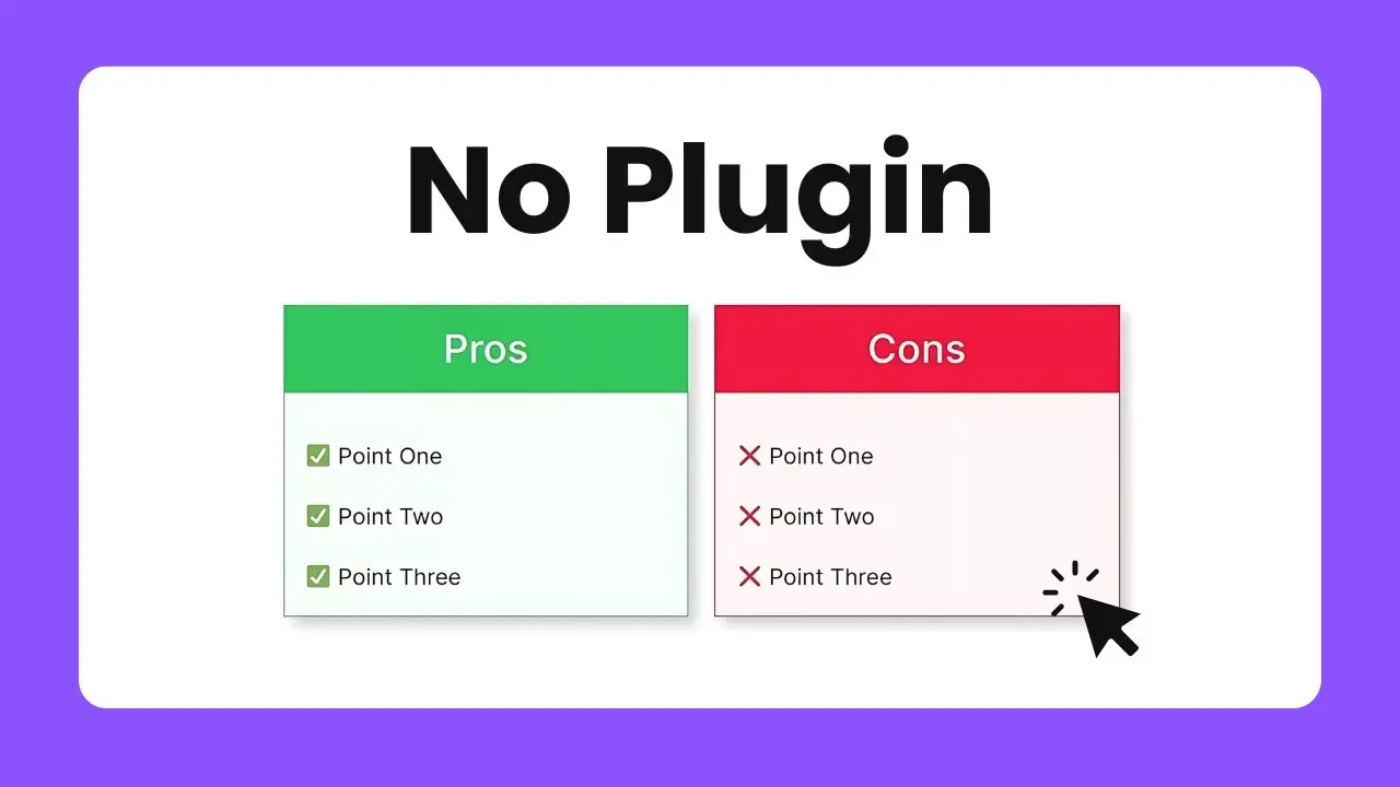
For each column, we’ll start by adding a Heading block. In the first column, type “Pros”, and in the second, “Cons”. These will serve as the titles for each section of our table.
Adding Content to Your Table
Now comes the fun part – adding our actual pros and cons. Under each heading, we’ll add another Group block. Within this Group block, we’ll use regular Paragraph blocks to list out our points.
Here’s a pro tip: to make your points stand out, consider using emojis or icons at the beginning of each item. For example, you could use a ✅ for pros and a ❌ for cons. This adds a visual element that makes your table more engaging and easier to read at a glance.
Styling Your Table
Now that we have our basic structure, it’s time to make it look good. Here’s where we can really flex our creative muscles:
- Adding Borders: Select each column and add a border. For the pros column, I like to use green, and for the cons, red. This color coding makes it immediately clear which side is which.
- Customizing Headers: Transform your headings into buttons. This might sound odd, but it allows us to easily change the background color of just the header area. Set the width to 100% and remove any border radius for a clean look.
- Background Colors: Add a light background color to each column. I usually use the same color as the border but with high transparency. This subtle touch helps differentiate the columns without being too loud.
- Padding: Don’t forget to add some padding to your Group blocks containing the pros and cons. This prevents your text from crowding the borders and improves readability.
Making Your Table Responsive
One of the best things about this method is that your table will automatically be responsive if you’re using a responsive WordPress theme. To test this, use the device preview option in the Gutenberg editor. You should see your table adjust nicely to different screen sizes.
Final Touches and Tips
- Save as a Pattern: Once you’re happy with your design, consider saving it as a reusable pattern. This way, you can quickly add pros and cons tables to future posts without starting from scratch.
- Experiment with Colors: While I’ve suggested green for pros and red for cons, feel free to experiment with colors that match your site’s branding. Just make sure there’s enough contrast for readability.
- Keep It Balanced: Try to have a similar number of points on both sides for a balanced look. If one side is significantly longer, consider adjusting your layout.
- Use Clear Language: When writing your pros and cons, be concise and clear. This isn’t the place for long, detailed explanations.
Creating a responsive pros and cons table in WordPress without a plugin is not only possible but also quite straightforward once you know the steps. This method gives you full control over the design and allows for easy updates and modifications.
Remember, the key to a great pros and cons table is not just in its design, but also in the quality of the information you present. Use this table to enhance your content and provide value to your readers.
By mastering this technique, you’re adding a powerful tool to your WordPress toolkit. Whether you’re reviewing products, comparing services, or just weighing options in a blog post, this responsive pros and cons table will serve you well.
So go ahead, give it a try! With a little practice, you’ll be creating professional-looking, responsive tables in no time. And the best part? No plugins required. Happy WordPress editing!