- Learn to create stunning background effects without third-party software
- Discover how to use Gutenberg’s gradient feature for sharp color separations
- Master the technique of overlaying transparent images for unique designs
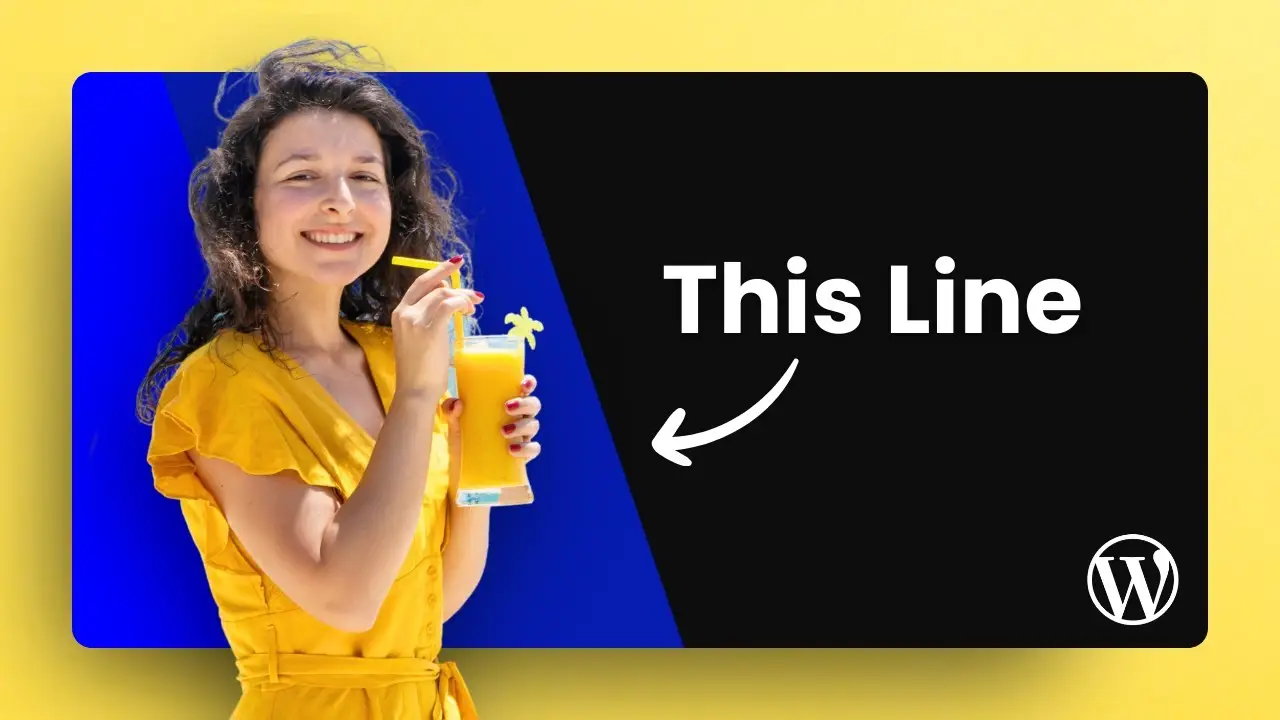
I recently stumbled upon an incredibly cool effect you can apply to images on your website using WordPress. This technique allows you to alter the background of an image without relying on any third-party software. The best part? It’s all done right within the Gutenberg editor. Let me walk you through the process of creating this separated color effect using the gradient feature in WordPress.
Before we dive into the step-by-step guide, I want to emphasize that this effect works best with transparent images. The colorful background you’ll see isn’t actually part of the image itself, but rather a customizable element you can modify directly in your website editor. This flexibility opens up a world of creative possibilities for your web design.
Setting Up the Background
To begin, we’ll need to create the foundation for our effect using the Gutenberg editor. Here’s how to get started:
- Add a Cover Block: Place your cursor where you want the image and type “/cover” to insert a cover block.
- Choose an Initial Color: Don’t worry too much about this choice, as we’ll be changing it later. For now, just pick any color you like.
- Adjust the Size: Click on the cover block, toggle “Full Height,” and ensure it’s set to “Full Width” as well.
Creating the Gradient Effect
Now comes the fun part – creating that eye-catching gradient effect:
- Access Block Styles: Click on the cover block and navigate to the “Block” tab, then “Styles.”
- Select Gradient: Under the “Overlay” section, choose the “Gradient” option.
- Choose Gradient Type: You’ll see two types of gradients – soft and hard. For this effect, we’ll be using the hard gradient.
- Set Color Points: Select the first control point and change its color. I used pink for this tutorial. Then, set the second control point to yellow.
- Add a Middle Color: Click anywhere on the slider to add another control point. I chose purple for this example.
- Duplicate the Middle Color: Add one more control point with the same color as the previous one (purple in this case).
Sharpening the Color Separation
To achieve those crisp, sharp lines between colors:
- Adjust Control Points: Move the control points so they overlap exactly. This creates the sharp separation between colors.
- Fine-tune Positions: Ensure the middle control points are precisely in the center, overlapping each other.
- Experiment with Angles: You can change the angle of the gradient to create different effects. Play around with this to find what works best for your design.
Adding the Transparent Image
Now that we have our colorful background, it’s time to add the star of the show – the transparent image:
- Insert Another Cover Block: Click within the existing cover block and add another cover block on top.
- Choose a Transparent Image: Select an image with a transparent background. This is crucial for the effect to work properly.
- Adjust Image Settings: Make sure the image is set to full width and fits appropriately within the block.
- Remove Opacity: In the block styles, remove any opacity settings to ensure the image is fully visible.
Fixing the Gap Issue
You might notice a small gap between the foreground and background covers. Here’s how to fix it:
- Use Document Overview: This feature gives you a bird’s eye view of your document structure.
- Select the Background Cover: In the document overview, choose the parent (background) cover.
- Adjust Padding: In the styles tab, set all padding to zero by moving the control points to the extremes.
Adding Content and Final Touches
To complete your design:
- Insert Content: Add any text or other elements you want to include in your design.
- Position Content: Use the position menu to place your content where you want it within the cover block.
- Fine-tune Padding: Adjust the padding as needed to ensure your content isn’t too close to the edges.
How to craft the perfect AI prompt for blog post
The Benefits of This Technique
Using this method offers several advantages:
- Flexibility: The background is independent of the image, allowing for easy color changes anytime.
- No Additional Software: Everything is done within WordPress, eliminating the need for external image editing tools.
- Dynamic Design: You can easily update your design by changing the gradient colors or angles without touching the image itself.
Taking It Further
For an extra touch of dynamism, consider applying a parallax effect to your foreground cover. This can add depth and interest to your design, making it even more engaging for visitors.
By mastering this technique, you’ll be able to create stunning, professional-looking designs directly in WordPress. The separated color effect using gradients is just one of many creative possibilities at your fingertips. Experiment with different color combinations, angles, and transparent images to develop unique and eye-catching layouts for your website.
Remember, the key to success with this method is in the details – precise control point placement, careful image selection, and thoughtful content positioning. With practice, you’ll be creating head-turning designs that will make your WordPress site stand out from the crowd.