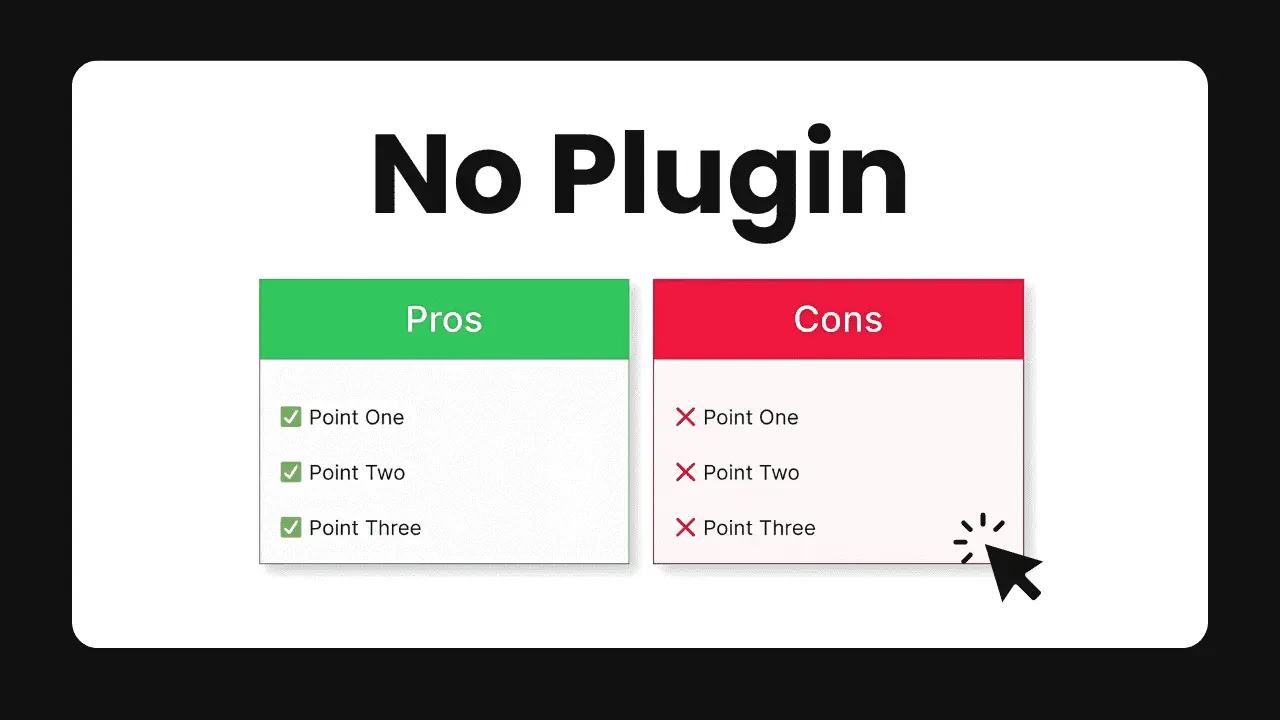
A pros and cons table is a great way to compare and contrast different options, products or services in a visually appealing format. It helps readers quickly understand the key advantages and disadvantages. In this article, we’ll walk through how you can easily create a responsive pros and cons table in WordPress without needing to install any additional plugins.
What You’ll Need
- A WordPress website with the Gutenberg block editor enabled
- Basic knowledge of using the WordPress block editor
Step 1: Add a New Block
Start by editing the post or page where you want to insert the pros and cons table. Click the “+” icon to add a new block and search for the “Columns” block. Insert a two-column layout.
Step 2: Add Headings for Pros and Cons
In the first column, add a Heading block and enter “Pros” as the text. Style it as needed – you may want to center align it and set a background color to make it stand out.
Repeat this in the second column, entering “Cons” as the heading text instead.
Step 3: List Out the Pros and Cons
Under each heading, add a List block. Enter the pros in the list under the “Pros” heading, and the cons under the “Cons” heading.
Format the list items as needed, for example using bold or italic styling to emphasize certain points.
Step 4: Add Icons (Optional)
To make the pros and cons more visually distinct, you can add a suitable icon before each heading. The easiest way is to use an emoji like a green check mark (✅) for pros and a red cross mark (❌) for cons. Simply insert these emoji in the heading text.
Step 5: Style the Table
Select the entire Columns block and apply background colors, borders, padding etc in the Block Settings sidebar to style the overall pros and cons table.
For example:
- Set a light gray background color for the whole table
- Add a 1px solid border around the table
- Set some padding on the columns to add spacing
Preview the design on desktop and mobile screen sizes to ensure it looks good on all devices.
Step 6: Save and Publish
Once you’re happy with how the pros and cons table looks, save your changes and publish or update the post or page.
Example of a Pros and Cons Table
Here’s how a pros and cons table created using the above steps might look:
| ✅ Pros | ❌ Cons |
|---|---|
| Easy to set up and use | Limited customization options compared to plugins |
| No extra plugin required | Have to manually update if content changes |
| Loads fast – no extra code loaded | Can’t easily re-use the same design |
Tips for Effective Pros and Cons Tables
- Keep the points concise – use keywords and short phrases rather than long sentences
- Aim to have a similar number of pros and cons
- Prioritize the most important and compelling points
- Make sure the table is visually balanced and easy to read
- Use color, icons and formatting to make the pros and cons stand out
Conclusion
Creating a responsive pros and cons table in WordPress is quite straightforward using the built-in blocks in the Gutenberg editor. By following the steps outlined above, you can set up an attractive table that looks great on any device, without having to install another plugin.
The pros and cons table is a versatile format that can be used in many different scenarios like comparing products, services, or outlining arguments for and against something. Try it out on your WordPress site to make your content more engaging and useful for readers.


