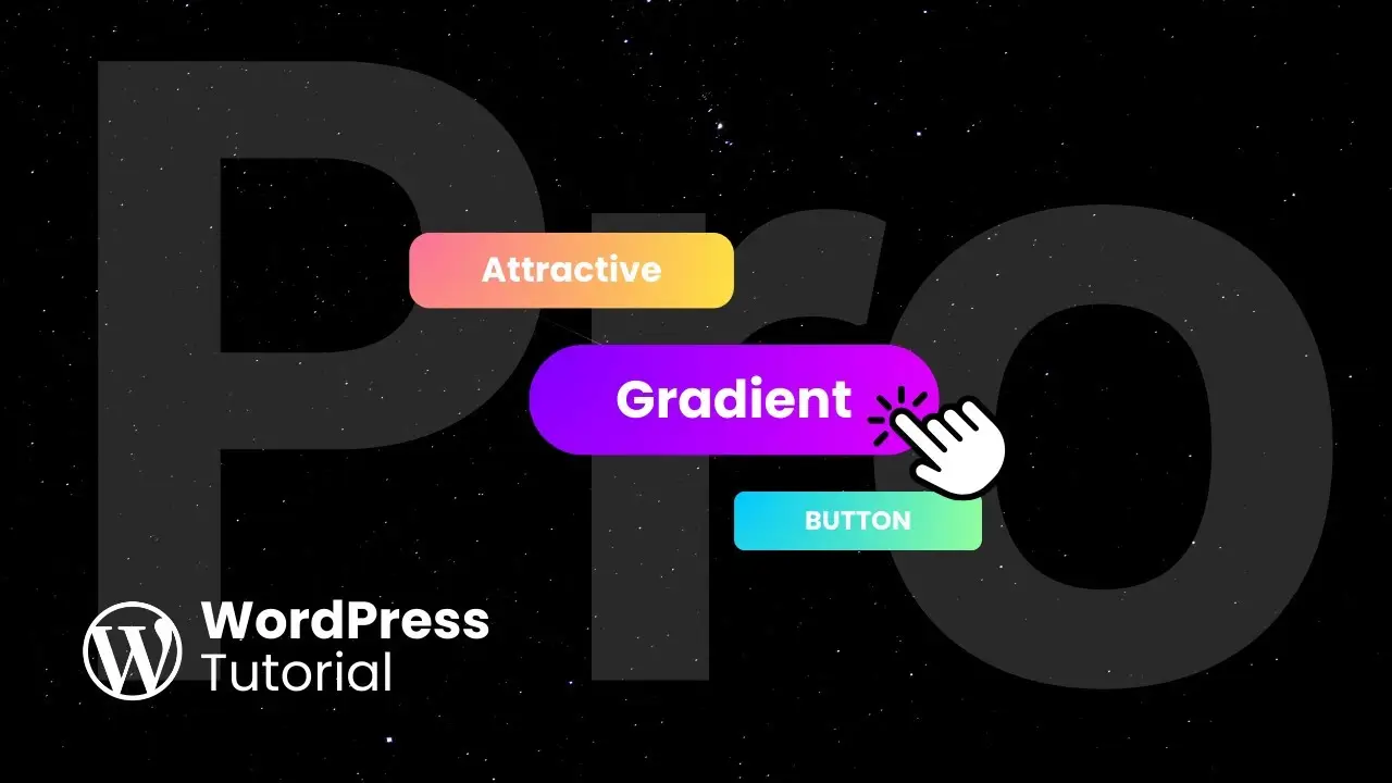
- Learn to create eye-catching gradient buttons without plugins or coding
- Discover top resources for selecting designer-approved gradient colors
- Master the art of customizing button styles in WordPress Gutenberg editor
As a WordPress enthusiast, I’m always on the lookout for ways to make my website stand out. One of the most effective methods I’ve found is using gradient buttons for calls-to-action (CTAs). These buttons are not only visually appealing but also more compelling than their solid-color counterparts. Today, I’m excited to share with you how to create these stunning gradient buttons without any plugins or coding knowledge.
Let me walk you through the process of creating a gradient button that will make your visitors want to click. We’ll be using the WordPress Gutenberg editor, which offers a user-friendly interface for customizing your website elements.
Getting Started with Button Creation
First things first, let’s create our button. In the Gutenberg editor, place your cursor where you want the button to appear. Type “SL” to bring up the block options, then select “Buttons.” Now, you can add your button text. For this example, I’m using “Contact Us.”
To make our button stand out, we’ll customize its appearance. I prefer centering my buttons for a balanced look. You can do this by selecting the button and choosing the center alignment option. Next, let’s increase the button size to “Large” for better visibility.
Button shape plays a crucial role in its overall appeal. I find that a slightly rounded button often looks more modern and inviting. To achieve this, I’m setting the radius to 20. Don’t forget to adjust the padding on the left and right sides to give your text some breathing room.
Adding the Gradient Effect
Now comes the exciting part – adding the gradient effect! Click on your button and navigate to the “Styles” tab. In the color section, click on “Background,” then select “Gradient.” WordPress offers some preset gradients, but in my experience, they often fall short of creating that wow factor we’re after.
This is where external resources come in handy. My go-to websites for stunning gradient colors are uigradients.com and designgradients.com. These sites offer a plethora of designer-curated gradients that can elevate your button’s appearance.
For this tutorial, let’s use uigradients.com. I’m particularly fond of the “Flare” gradient under the orange category. It’s vibrant and eye-catching – perfect for a CTA button.
Applying the Gradient to Your Button
Here’s how to apply your chosen gradient:
- Copy the first color code from uigradients.com.
- Return to WordPress and click on the left point of the gradient slider.
- Paste the color code into the color field.
- Repeat the process for the second color, using the right point of the gradient slider.
The final touch is adjusting the gradient angle. I find that a 45-degree angle often works well, but feel free to experiment. Remember, design is subjective, so choose what looks best for your site.
Previewing Your Creation
Once you’re satisfied with your gradient button, it’s time to see it in action. Click the preview button to open your page in a new tab. You should now see your beautifully crafted gradient button ready to captivate your visitors.
Taking It a Step Further
If you want to add even more flair to your buttons, consider adding icons. Icons can enhance the visual appeal and provide a quick visual cue about the button’s function.
Why Gradient Buttons Matter
You might be wondering, “Why go through all this trouble for a button?” Well, in the world of web design, details matter. A well-designed button can significantly improve your click-through rates and overall user experience.
Gradient buttons stand out because they add depth and dimension to your page. They catch the eye without being overpowering, guiding your visitors towards important actions on your site. Whether it’s a “Sign Up” button for your newsletter or a “Learn More” link to your services page, a gradient button can make all the difference.
Best Practices for Using Gradient Buttons
While gradient buttons are fantastic, it’s important to use them judiciously. Here are some tips to keep in mind:
- Consistency is key: Use similar gradient styles across your site for a cohesive look.
- Consider contrast: Ensure that your button text is easily readable against the gradient background.
- Don’t overdo it: Use gradient buttons for your most important CTAs to maintain their impact.
- Test on multiple devices: What looks great on your desktop might not translate well to mobile, so always check your design on various screen sizes.
Troubleshooting Common Issues
Sometimes, things don’t go as planned. If you’re having trouble with your gradient button, here are a few things to check:
- Make sure you’ve copied the color codes correctly.
- Verify that you’ve selected the gradient option in the background settings.
- If your button looks different on the live site, try clearing your cache or viewing in an incognito window.
Enhancing Your WordPress Skills
Creating gradient buttons is just the tip of the iceberg when it comes to customizing your WordPress site. If you’re interested in diving deeper, consider exploring how to create reusable blocks in WordPress. This can save you time and ensure consistency across your site.
For those looking to optimize their site’s performance, learning how to reduce plugin reliance can be a game-changer. Fewer plugins often mean faster load times and a smoother user experience.
Conclusion
Mastering the art of creating gradient buttons in WordPress is a valuable skill that can significantly enhance your website’s appeal. By following the steps outlined in this guide, you can create professional-looking buttons that engage your visitors and encourage them to take action.
Remember, the key to great web design is experimentation. Don’t be afraid to play around with different color combinations, angles, and styles until you find what works best for your site. And most importantly, have fun with it! Web design is as much an art as it is a science, so let your creativity shine through.
As you continue to refine your WordPress skills, you’ll find that small touches like gradient buttons can make a big difference in how users perceive and interact with your site. So go ahead, give your CTAs a gradient makeover, and watch as your website transforms into a more engaging and professional platform.
Happy designing!