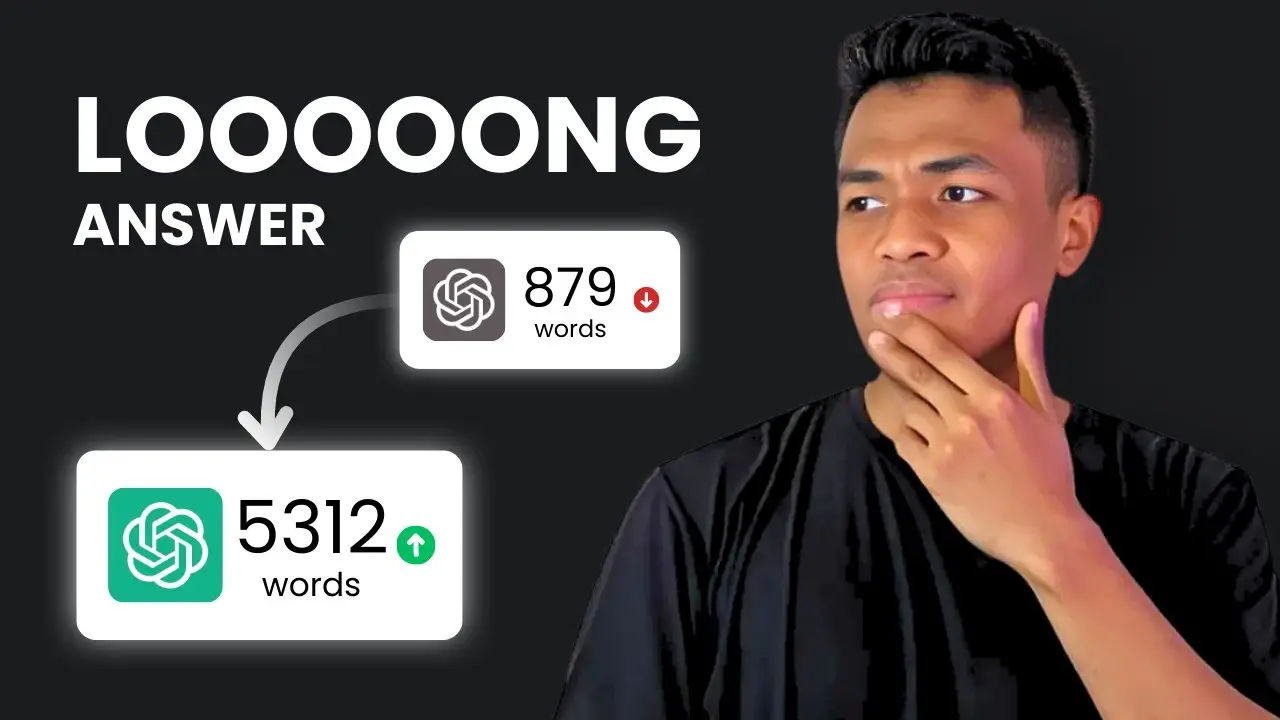
Key takeaways:
- AI images often look weird and don’t add much value to blog posts.
- Napkin AI and Piktochart turn your text into real visuals that actually help your readers.
- Infographics and diagrams beat generic AI art every time for clarity and engagement.
So, here’s the deal: AI images are everywhere, and most of them just aren’t it. I’ve seen way too many blog posts and articles stuffed with random AI art that doesn’t fit, looks awkward, or just feels like filler. We all want our content to pop, but there’s a better way. If you’re tired of those off-looking AI pictures and want something that actually helps your readers, I’ve got you.
This post is all about how to make your content stand out with visuals that matter—using Napkin AI and Piktochart. If you want your posts to be clear, professional, and actually useful (not just pretty), you’re in the right place. Let’s get into it. 🚀
Why AI Images Aren’t Cutting It for Blog Posts and Articles
I’ve tried using AI images in my own content. Sometimes they’re okay for a zoomed-out background or a thumbnail, but when you need something specific—like a closeup of a bicycle drive train—it all falls apart. The details are always off. Hands look weird, text is unreadable, and the vibe is just… not right.
Even with the best prompts and the latest models like Midjourney or Stable Diffusion, you end up with images that almost work but never quite hit the mark. Readers notice. It makes your content look less trustworthy, and honestly, it can hurt your credibility.
Here’s the thing: visuals are a must. Google loves them, readers love them, and your social posts will get more engagement if you use them. But generic AI art isn’t the answer. So, what is?
The Real Solution: Visuals That Actually Help Your Readers
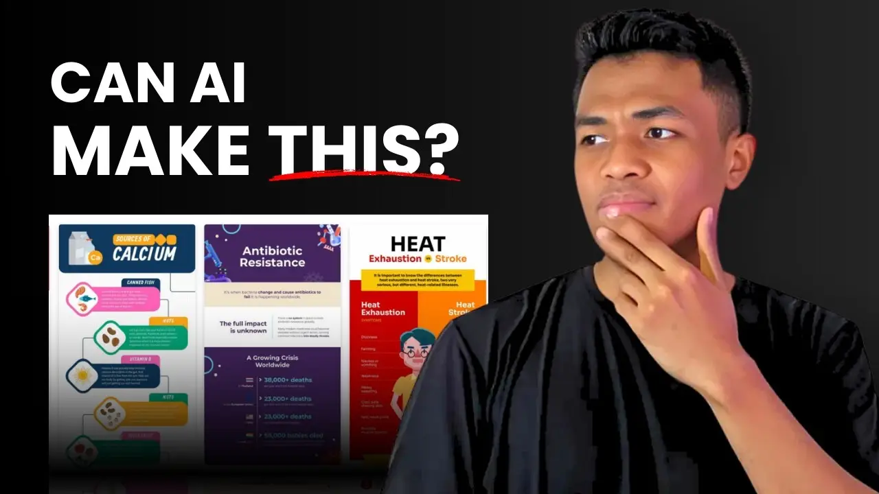
Infographics, Diagrams, and Charts Are the Way to Go
Visual content doesn’t have to mean just photos or illustrations. In fact, diagrams, charts, and infographics are way more useful for your audience. They break down complex info, make your points clearer, and give your blog post a professional edge.
But making these by hand? That’s a pain. It takes forever and usually means you’re stuck fiddling around in Canva or PowerPoint for hours. That’s where Napkin AI and Piktochart come in.
How Napkin AI Instantly Turns Text Into Useful Visuals
Napkin AI is my new go-to. Here’s why:
- Paste your text, and it analyzes the content.
- It suggests diagrams, charts, and other visuals that fit your info.
- You can pick a style, tweak the colors, and export the image in seconds.
What I really like is that the text in the visuals is actually readable. Numbers are clear, icons make sense, and you can match the colors to your brand. It’s not just for documents or presentations—you can use these visuals on your blog, social media, or anywhere you want to make your content pop.
Napkin AI is still in beta and free (for now), so it’s a good time to try it out. You just sign up, start a new project, paste your content, and let the AI do its thing. You can even copy the image straight into WordPress with Ctrl+V, which is a huge time saver.
Piktochart: For When You Want More Professional, Polished Infographics
If you want something a little fancier, Piktochart is the move. It’s built for infographics, presentations, and reports. Here’s what makes it stand out:
- Tons of templates, so you don’t start from scratch.
- AI can generate infographics from your text or uploaded files.
- You can customize everything—colors, icons, layout, you name it.
Piktochart is perfect for comparison charts, data visualization, or when you want your visuals to look extra polished. It’s a bit more advanced than Napkin AI, but still super easy to use. Just paste your content, pick a template, and you’re good to go. You can edit as much or as little as you want, then download your graphic for your blog or social media.
Napkin AI vs Piktochart: Which One Should You Use?
Here’s a quick side-by-side to help you decide:
| Feature | Napkin AI | Piktochart |
|---|---|---|
| Speed | Super fast, instant | Fast, but more steps |
| Customization | Good, basic styles | Advanced, lots of options |
| Templates | Limited | Tons of templates |
| Best for | Quick diagrams, blog posts | Detailed infographics |
| Price | Free (beta), $9.99+ later | Free plan, $12.95+ for pro |
If you just want to break up your text and make your posts easier to skim, Napkin AI is perfect. If you’re making a report, a presentation, or want something that looks super pro, go with Piktochart.
How to Get Started With Both Tools
Napkin AI
- Go to napkin.ai and sign up.
- Start a new project, paste your text.
- Click the bolt icon to generate visuals.
- Pick your style, tweak colors if you want.
- Export and use it wherever you need.
Piktochart
- Visit piktochart.com, make an account.
- Choose “Create with AI” and pick a template.
- Paste your content or upload your doc.
- Let AI generate your infographic.
- Edit, download, and share.
Both tools are easy enough for anyone to use—no design skills needed.
Why Infographics and Diagrams Beat AI Art Every Time
Here’s why I switched:
- Readers actually get value from visuals that explain something (not just fill space).
- Infographics can summarize key points, making your post easier to skim.
- Diagrams and charts help people remember your info and share it.
- Google and social platforms love content with real, relevant visuals.
Plus, you avoid all the weird hands, broken bikes, and awkward faces that come with generic AI art.
Don’t Forget: Good Text Still Matters
One last thing—your visuals are only as good as your words. Make sure your content is clear, accurate, and well-written. If you need help with writing or research, tools like Perplexity can help you get there.
FAQs
Why do AI images look weird sometimes?
AI images often mess up details like hands, faces, or objects because the models don’t truly understand what they’re drawing. They just remix patterns from their training data, so mistakes are common—especially on closeups.
Are Napkin AI and Piktochart free to use?
Napkin AI is free while in beta, but may charge later. Piktochart has a free plan with limits, and paid plans for more features.
Can I use these visuals on social media?
Absolutely. Both Napkin AI and Piktochart let you export images you can use on your blog, LinkedIn, Twitter, or wherever you want to share your content.
Do infographics help with SEO?
Yes. Infographics and diagrams make your content more engaging and easier to understand, which can boost time on page and shares—both good for SEO.
What if I still want to use AI images sometimes?
You can! AI images are fine for backgrounds or illustrations where details don’t matter. Just don’t rely on them for anything important or detailed.
Try swapping out those awkward AI images for visuals that actually help your readers. Your content (and your audience) will thank you. ✌️