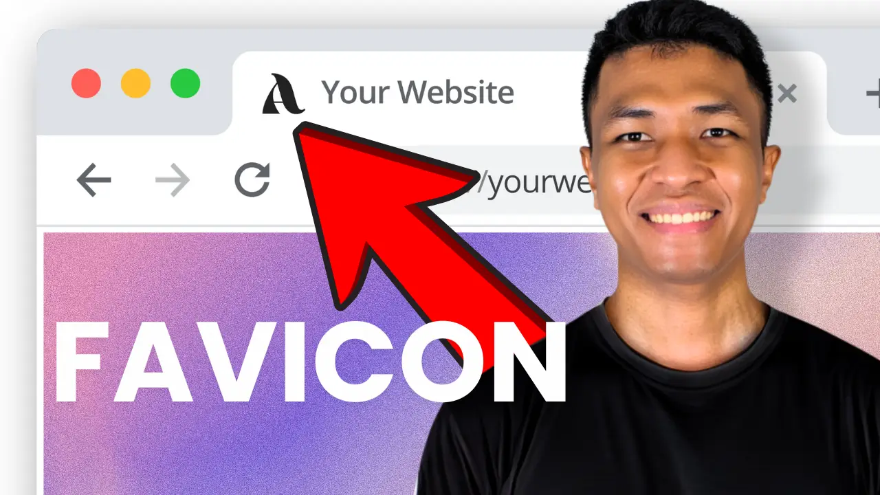
- Learn the importance of a simple, recognizable site icon for your brand
- Discover best practices for creating and optimizing your WordPress site icon
- Understand the pros and cons of transparent vs. solid background icons
I’ve been working with WordPress for years, and one of the most overlooked aspects of site design is the site icon, also known as a favicon. It’s that tiny image you see in your browser tab, and believe it or not, it plays a crucial role in your brand’s online presence. Today, I’m going to walk you through the process of changing your WordPress site icon and share some best practices I’ve picked up along the way.
First things first, let’s talk about what makes a good site icon. The key is simplicity and recognizability. You want something that represents your brand but is still clear at a small size. Take Nothing, the new phone brand, for example. Their logo is the word “nothing,” but for their site icon, they use a simple red dot. It’s an element from their logo that works perfectly at a small scale.
Another approach is to use the first letter of your brand name. This can be a great option if you have a text-based logo. The important thing is to keep it simple and ensure it’s easily identifiable even at 32×32 pixels.
Now, let’s get into the nitty-gritty of changing your site icon in WordPress. I’ve created a video tutorial to guide you through the process step-by-step. Check it out here:
One thing to note: this tutorial is for third-party WordPress themes. First-party themes like 2022, 2023, and 2024 use a different editing principle, which I’ll cover in a future video.
When creating your site icon, size matters. WordPress can use icons as small as 32 pixels, but I recommend going bigger – at least 512 pixels. This ensures your icon looks crisp and clear, even when someone creates a shortcut to your site on their desktop.
Now, let’s talk about a crucial decision you’ll need to make: transparent or solid background? This choice can significantly impact how your icon appears across different browser themes and settings. I learned this the hard way when I first changed my site icon.
I initially used a transparent background, thinking it would look sleek and modern. It looked great on my computer with a light theme, but when I switched to dark mode, the icon practically disappeared! That’s when I realized the importance of considering how your icon will look in different contexts.
To illustrate this point, let’s look at some big brands and how they handle their site icons:
- Google and OpenAI use solid backgrounds, ensuring their icons are visible in both light and dark modes.
- Rabbit uses a transparent background but gets away with it because their logo shape is distinct and recognizable.
- The Verge, however, struggles with visibility in dark mode due to their purple logo on a transparent background.
After experimenting, I found that using a solid background is often the safest bet. It ensures your icon is visible regardless of the user’s browser theme. However, if your logo has a distinct shape like Rabbit’s, you might be able to pull off a transparent background.
One last tip: don’t forget about file size. A large file can slow down your site, so it’s worth compressing your icon. I use TinyPNG to compress my images without losing quality. It’s free and can significantly reduce file size – in my case, from 12KB to just 4KB!
After you’ve uploaded your new site icon, remember that it might take a while for the changes to appear if you’re using a caching plugin. You can speed up the process by clearing your cache.
Creating the Perfect Site Icon: A Quick Checklist
- Keep it simple and recognizable
- Use elements from your main logo or your brand’s first letter
- Make it at least 512×512 pixels for best quality
- Consider using a solid background for better visibility
- Compress the file to optimize loading speed
Remember, your site icon is often the first visual element users associate with your brand online. It’s worth taking the time to get it right. How to craft the perfect AI prompt for blog post can help you create compelling content to accompany your new site icon.
If you’re just starting with WordPress, you might want to check out my guide on how to start a WordPress site for beginners. It covers all the basics you need to know to get your site up and running smoothly.
And don’t forget about the other aspects of your site design. A great site icon is just one piece of the puzzle. For inspiration on overall website design, take a look at these WordPress website design inspirations. You might find some ideas to make your site stand out even more.
Changing your WordPress site icon might seem like a small detail, but it’s these little touches that can make a big difference in how users perceive your brand online. Take the time to create an icon that represents your brand well and looks great in all contexts. Your visitors will appreciate the attention to detail, and you’ll have a more professional-looking site as a result.
Remember, your website is often the first impression potential customers have of your business. Make sure every element, from your site icon to your content, reflects the quality and professionalism of your brand. Happy WordPress-ing!


